|
||
|
|
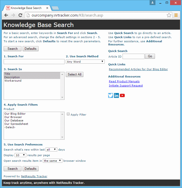
The Search Page is the first page users will see when they attempt to use the Knowledge Base. The URL for this page is:
http://servername/workgroup/kb/search.asp
where servername is the TCP / IP name of the machine where Tracker is installed and workgroup is the name of the Tracker workgroup you created as the Knowledge Base. An example of a Search Page is shown in the image below. The Search Page is configured with default settings. A detailed explanation of the default settings can be found in the section Using the Knowledge Base template.
Topics Covered In This Section
To customize the Search Page:
Header or Footer - Click on the Header or Footer button to the left of Search Page on the Knowledge Base Configurations Page to customize the Header or Footer section of the Search Page. You can enter your own custom HTML into the text box provided. You may wish to add your company logo or other branding or instructional text into the custom HTML sections. Click OK to save your changes. Please do not enter any header tags into this area. Some examples of header tags are <HTML>, </HTML>, <BODY>, </BODY>. If you wish to display an image in the Header or Footer, you can upload the file as a global file attachment.
Page Title - Enter up to 80 characters to be displayed as the page title in the browser. The text you enter will be displayed before the browser name (as shown by the text "Knowledge Base Search" before "Microsoft Internet Explorer" in the sample above). You can use the variable <workgroup> to include the name of the workgroup as part of the Page Title.
Several items can be customized in the Contents of the Search Page. The Contents section contains the tools end users will employ to search through the Knowledge Base. The settings you choose in this page will determine how users will be able to conduct searches to return the desired information.
To customize the options on the Contents page:
For all components that can be customized as Contents of the Search Page, a Visible column displays whether this component is visible to users on the Search page. The value "Yes" displayed in the Visible column indicates that the component is visible. By default, all components are visible. To remove the component from being displayed on the Search page, click on the Edit button and uncheck the box for the Is Visible option, then click OK to save your change. When a component is not visible ("No" displayed in the Visible column for that component), the default selection for this component will be used during all searches. The default settings are described in the component details below. The components Search Words, Right Pane, and Left Pane must be visible (no option is available to make these components not visible on the Search Page).
Search Words is the component where users enter the key word(s) to be used as search criteria. Click on the Edit button to the left of "Search Words" to customize the label. By default, this is set to "1.Search For". Click OK to save your changes.
This component displays the allowed methods of searching the Knowledge Base information. Examples of Search Methods are "All Words", "Any Word", "Exact Phrase", and "Boolean Expression".
Click on the Edit button to modify the label of this field. By default, it is set to "2. Use Search Method". Click OK to save the change.
When the Is Visible box is checked, this component is displayed on the Search Page. If you choose to make this component invisible by unchecking the box, the value selected in the Set Default section will be used for all searches.
Click on the Select Methods button to choose which Search Methods will be provided for use while searching the Knowledge Base. Click on a method to highlight it and click OK to save. At least one method must be selected. Multiple search methods can be selected by holding the "CTRL" button on your keyboard while clicking on multiple search methods.
Search Method Examples
|
Click on the Set Default button to choose which Search Method will be used as the default. If the Search Methods component is visible on the Search Page, the default will be selected as the search method for all searches unless changed by the user performing a search. If it is not visible on the Search Page, the default will be used as the Search Method for all searches. Click OK to save your default selection.
Any of the text fields (fields of the format Text or TextArea) created in the Fields section can be selected as part of the Knowledge Base search. The settings for this component determine which text fields within the Knowledge Base articles will be searched to find a match for the key word(s) entered in the Search Words field.
Click on the Edit button to modify the label for this component. By default, it is set to "3. Search In".
When the Is Visible box is checked, this component is displayed on the Search Page. If you choose to make this component invisible by unchecking the box, the value selected in the Set Defaults section will be used for all searches.
Click on the Select Fields button to choose which fields are available as Search Fields on the Search Page. At least one value must be selected for this field. Multiple values can be selected for this field by holding down the "CTRL" button on your keyboard as you click on multiple fields. Click OK to save your selections.
Click on the Set Defaults button to select which fields are selected by default. If the Search Fields component is visible on the Search Page, the default(s) will be selected for all searches unless changed by the user performing the search. If it is not visible on the Search Page, the default(s) will be used for all searches. Multiple values can be selected for this field by holding down the "CTRL" button on your keyboard as you click on multiple fields. Click OK to save your default selections.
Any of the pulldown fields created in the Fields section can be selected to narrow down the search. The settings for this component determine which pulldown fields and their corresponding option menu items can be selected as filters. Selecting an item(s) as a filter on the Search Page will cause the search to return all articles that match the Search Words criteria AND match the filter(s) selected.
Example: Product is configured as a Search Filter. The Product field contains an option menu item called "Our Browser". When "Our Browser" is selected as a filter when performing a search of the Knowledge Base, the search results will be all articles that matched the key word(s) entered into the Search Words field AND have "Our Browser" selected for the Product field.
Click on the Edit button to modify the label for this field. By default, this is set to "4. Apply Search Filters".
When the Is Visible box is checked, this component is displayed on the Search Page. If you choose to make this component invisible by unchecking the box, the value selected in the Set Defaults section will be used for all searches.
Check the box for Allow Multiple Selection for Filters if you wish to allow users to select more than one option menu item in each filter to be used in the search. When multiple option menu items are selected as filters, the search will return all articles which match the criteria listed in the Search For field AND which match one of the option menu items selected as filters.
Example: Product is configured as a Search Filter. The Product field contains option menu items called "Our Browser" and "Our Database". When "Our Browser" and "Our Database" are selected as filters when performing a search of the Knowledge Base, the search results will return all articles that matched the key word(s) entered into the Search Words field AND have either "Our Browser" OR "Our Database" selected for the Product field.
Check the box for Include 'Apply Filter' option if you wish to allow users to choose which filters should be applied. Unchecking this box indicates that a user will have to select an option menu item for each filter displayed, which will be used as part of the search criteria.
In the Apply Filter Label field, enter the name to be used for the check box option on the Search Page which determines whether the filter will be used in the search. By default, this label is "Apply Filter".
Select an option for Initial Apply Filter Settings.
For the Include Obsolete Items option, check the box if you wish to allow option menu items that have been marked as obsolete to be available as search filters. Option menu items that have been marked as obsolete are values that have been deactivated in the pulldown field's Items section.
Click OK to save your selections for the Search Filters component.
Click on the Select Filters button to select the pulldown fields that will be displayed as possible filters on the Search page. Multiple values can be selected by holding down the "CTRL" button on your keyboard as you click on multiple fields. Selecting a pulldown field indicates that all option menu items with the "Value Is Public" option enabled for this pulldown will be displayed as possible filters on the search page. Click OK to save your selections.
Click on the Set Defaults button to select the option menu item(s) that will be selected by default as Search Filters. If the Search Filters are set to be visible on the Search Page, the default(s) will be selected as filters for all searches unless changed by the user performing the search. If the Search Filters are not visible on the Search Page, the default(s) (if any) will be used for all searches. Multiple values can be selected for each filter by holding down the "CTRL" button on your keyboard as you click on multiple fields. Click OK to save your selections.
This option allows you to define the following preferences for the search results:
Click on the Edit to modify the label for this field. By default, it is set to "5. Use Search Preferences".
When the Is Visible box is checked, this component is displayed on the Search Page. If you choose to make this component invisible by unchecking the box, the values selected in the Set Preferences section will be used for all searches. Click OK to save your changes.
Click on the Set Preferences button to configure the Search Preferences. You can choose to display each preference by checking the box in the Visible column
The preference Search what's new within the last given number of days from a Date Field narrows the search results to be articles that were modified within the last X number of days from the Date Field selected. You can select a default setting for the number of days by making a choice for this field in the Preference column. The available choices for number of days are all, 2, 7, 14, 30, 60, 90, 180. You can also set which date field is referenced to determine the article's age for all searches. All of the Date type fields in use in the Knowledge Base workgroup as well as the Last Updated Date field will be displayed as choices for this setting. If this preference is visible on the Search Page, the users can specify the number of days to limit the search results. If this preference is invisible, the default number of days set as the default will be used for all searches.
The preference Display a given number of results per page sets the number of articles that will be displayed per page in a list as the result of a search. A default can be set by making a choice in the Preference column for this field. The choices for this setting are 10, 20, 30, 50, 100. If the field is visible on the Search page, users will be able to make their own selection from the above choices. If the field is invisible, the default choice will be used for all searches.
The preference Open search results item in same or new window allows you to choose whether the list of results are displayed in the same browser window as the Search Page or are opened in a new browser window. If this field is visible on the Search Page, the users can make their own selection. If it is invisible, the value set in the Preference column will be used for all searches.
After making your selections, click OK to save the preferences.
Quick Search is a feature that allows end users to type in the number of the Knowledge base article he or she wishes to see to immediately view that article.
Click on the Edit to modify the label for this field. By default, it is set to "Quick Search".
When the Is Visible box is checked, the Quick Search section will be displayed on the Search Page. Click OK to save your changes.
Quick Links is a feature that allows you to save Knowledge Base searches with particular criteria as links on the Search Page. Your end users can click on these links to immediately run one of the saved search reports.
Click on the Edit to modify the label for this field. By default, it is set to "Quick Links".
When the Is Visible box is checked, the Quick Links section will be displayed on the Search Page. Click OK to save your changes.
Click on the Modify Links button to add and edit the Quick Links displayed on the Search page. A new browser window will be launched with the Knowledge Base Search Page displayed.
To add a Quick Link:
To edit a Quick Link, click on the Edit icon to the right of the Quick Link in the right pane.
To delete a Quick Link, click on the Delete icon to the right of the Quick Link in the right pane.
The right and left panes on the Search Page can be customized to add your own custom HTML to the Header and Footer. These sections can be used to provide instructions about how to use the Search Page, links to additional resources for your end users, etc.
Click on the Header or Footer button to the left of Right Pane or Left Pane to customize the Header or Footer section of either pane. You can enter your own custom HTML into the text box provided. Click OK to save your changes. Please do not enter any header tags into this area. Some examples of header tags are <HTML>, </HTML>, <BODY>, </BODY>.
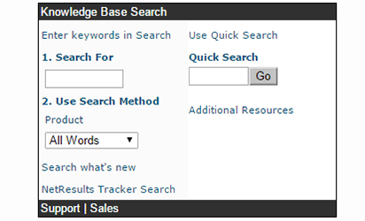
By default, HTML has been entered to provide the following information in the panes:
You can customize the color scheme displayed on the Search Page.
To customize the color preferences on the Search Page:
Color Preferences
The following color preferences can be set for the Search Page.
General Settings
Page Background - The background color for the body of the Search Page. The Page Background is not usually visible on the Search Page; it depends on how many fields and options are available on the Search Page.
Header Background - The background color of the section at the top of the Search Page (e.g. the color behind the text "Knowledge Base Search" in the Search Page Sample).
Header Text - The color of the text displayed in the top section of the Search Page (e.g. the color of the text "Knowledge Base Search" in the Search Page Sample).
Footer Background - The background color of the section at the bottom of the Search Page (e.g. the color behind the text "Support | Sales" in the Search Page Sample).
Footer Text - The color of the text in the bottom section of the Search Page (e.g. the color of the text "Support | Sales" in the Search Page Sample).
Left Pane Settings
Background - The background color in the left pane of the Search Page (e.g. the color behind the text "1. Search For" in the Search Page Sample).
Header Background - The background color of the top section of the left pane (e.g. the color behind the text "Enter keywords in Search" in the Search Page Sample).
Footer Background - The background color of the bottom section of the left pane (e.g. the color behind the text "NetResults Tracker search" at the bottom of the left pane in the Search Page Sample).
Title Text - The color of the text displayed above the Search options in the left pane (e.g. the color of the text "1. Search For" in the Search Page Sample).
SubTitle Text - The color of the text displayed for any sub titles in the Left Pane (e.g. the color of the text "Product" in the Search Page Sample).
Body Text - The color of the text displayed within the body of the left pane (e.g. the color of the text "Enter keywords in Search", "Search what's new" and "NetResults Tracker Search" in the Search Page Sample).
Warning Text - The color of the text that is displayed when there is a warning about an item on the Search Page (e.g. when a field is selected as a Search Filter, but does not have any option menu items that are public to be used as filters).
Right Pane Settings
Background - The background color in the right pane of the Search Page (e.g. the color behind the text "Quick Search" in the Search Page Sample).
Header Background - The background color of the top section of the right pane (e.g. the color behind the text "Use Quick Search" in the Search Page Sample).
Footer Background - The background color of the bottom section of the right pane (e.g. the color behind the text "NetResults Tracker search" at the bottom of the right pane in the Search Page Sample).
Title Text - The color of the text displayed above the Search options in the right pane (e.g. the color of the text "Quick Search" in the Search Page Sample).
Body Text - The color of the text displayed within the body of the right pane (e.g. the color of the text "Use Quick Search" and "NetResults Tracker Search" in the Search Page Sample).
A style sheet is used to determine the size, style and family of the fonts on the Search Page. You can use your own style sheet by placing a copy of your style sheet into the Styles directory of your workgroup's Knowledge Base files. Any color options set in the style sheet will be overridden by the settings in the Color Preferences section for the Search Page. The directory can be found at:
<installation directory>/workgroup/KB/Styles
where <installation directory> is the location where you installed your Tracker files. By default, the <installation directory> is at C:\Inetpub\wwwroot\NetResultsTracker and workgroup is the name of the workgroup used as Knowledge Base.
Click on the Style button to the left of the Search Page to specify the name of your customized style sheet. In the Style Sheet File Name field, enter the name of your style sheet file in the format FileName.Extension as in the example KBStyle6.css, which is the style sheet used by default.
Check the box for the option Apply to all pages to apply the style sheet entered in the Style Sheet File Name field to all pages related to the Knowledge Base. Enabling this option will overwrite any other style sheets specified in the Style section for the Results and Item pages.
Click OK to save your selections.
NetResults Tracker © 1997-2017 NetResults Corporation. All rights reserved.
 NetResults Tracker Help