|
||
|
|
The Metrics operation is a way to gather and display statistical information based on your Tracker data. The information can be displayed as different chart types (bar, line, pie and others) using system defined Chart Layouts to specify the format for the chart. You can limit the records included in the statistical calculations (Input Records) by specifying a Saved Query. Only those records which match the Saved Query will be used when performing the statistical calculations. Chart parameters can be stored away for future runs as Saved Charts (for global, group, or personal use).
Topics Covered in This Section
Running a Chart
A chart can be generated using the "Project Status (Default) [Users]" Saved Chart or any other saved chart that has been added by a Tracker user with the appropriate privilege(s) by performing the following steps:
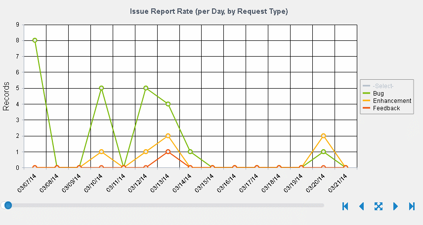
If a chart has more than 20 data points, a scroll bar is available at the bottom to change what data is being as shown in the scroll bar sample. By default, the last 20 data points will be displayed. Drag the scroller to increase or decrease the amount of data being displayed. Or, use the options to the right of the scroll bar to jump to different data sets. The options available are "First", "Previous", "All", "Next" and "Last".
If a legend is displayed, you can click on a legend item to exclude it from the chart data. Click on the excluded item again to restore it.
After generating a chart, you can click on the Print link in the upper right corner of the page to print the chart.
After generating a chart, click on the Export link in the upper right corner of the page to export the chart data to a CSV (comma separated values) file. You can then open this file with another tool such as Microsoft Excel.
To create a chart in Microsoft Excel from the exported data, "rubber band" (left-click mouse and drag a rectangle around) the data plus column and row titles (exclude rows 1 through 3, but include the individual row/column titles in row 4 and column A along with the data in your selection) and click the Chart Wizard icon (or select Insert->Chart...). Click the Finish button in the Chart Wizard to accept the Microsoft Excel default settings for the chart; or make selections, click on the Next button, then click Finish to create a chart with custom settings. Please review the Microsoft Excel Help for further information on Excel charts.
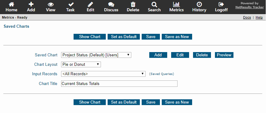
You can set a default such that whenever you click on the Metrics icon a particular Saved Chart, Chart Layout, Input Records, and Chart Title will be ready to be displayed by clicking on the "Show Chart" button. By setting a default, you will be one click away from seeing your default chart when you go to the Metrics page. This is useful if there is a particular chart you will be displaying on a frequent basis.
To set a default for the Metrics page:
The "Save" operation allows you to change the saved chart layout, input records, or chart title associated with a saved chart. You must have the appropriate privilege to perform this operation on a group saved chart. To make changes to a saved chart on the Metrics main page:
Save as New
The "Save as New" operation allows you to save a new chart based on the settings displayed on the "Select a Saved Chart" page or when previewing a saved chart. On the "Select a Saved Chart" page, this operation allows you to create a new saved chart with different selections for Chart Layout, Input Records, and Chart Title.
To use the "Save as New" operation on the "Select a Saved Chart" page:
To use the "Save as New" operation after previewing a saved chart, review the instructions in the preview section.
Restrictions Related to Saved Group Charts
Depending on the user group privileges that have been assigned to your by your Tracker Administrator, you may only be able to use certain operations on certain saved charts for groups. For example, if you are a member of 2 user groups, but only have privileges to edit group saved charts for one of those user groups, some of the operations (e.g. "Add", "Edit") may be disabled when selecting a saved chart for a group where you have limited privileges.
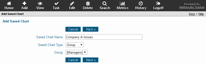
To create a saved chart, perform the following steps:
Editing a Saved Chart
A saved chart can be edited using the steps below. Some examples of changes you can make are:
Change the Name of the Chart
To change the name of a chart, use the steps below and change the
Saved Chart Name property.
Display the Chart with a Different Layout
To change the type of chart displayed (e.g. whether it is a pie, bar, table or other layout),
use the steps below to change the Default Chart Layout.
Use a Saved Query to Limit the Data Included in the Chart Results
To change what data is included in the chart, use the steps below to change the
Input Records option.
Show Longer Labels
If some labels are being truncated due to long option menu item names, use the steps
below to change the Max Label Length property.
Change What's Being Calculated
To change the calculation and breakdown items, use the steps below to change
the Calculate the ..., Perform calculations ... and Breakdown calculations ... options.
To edit a saved chart, perform the following steps:
Deleting a Saved Chart
To delete a saved chart, perform the following steps:
Previewing a Saved Chart
The preview operation allows you to make changes to the criteria of a saved chart before using the "Show Chart" operation to display the chart. This operation is useful when you want to display a chart with a change in the criteria for a saved chart, but want to preserve the saved chart's original settings. This is also useful for creating a new saved chart based on the criteria of an existing saved chart.
To preview a saved chart, perform the following steps:
Standard Saved Chart within Tracker
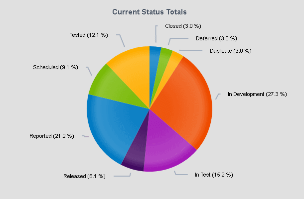
Within Tracker, the chart Project Status (Default) [Users] is installed by default. The description below is how the chart is configured by default, but your Tracker Administrator or another user with the appropriate privileges may have changed the chart's settings. This chart cannot be deleted.
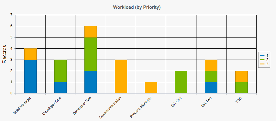
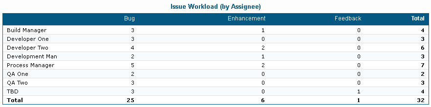
Project Status (Default) [Users]: A saved chart that will generate a pie chart, which displays the relative number of records in each possible state for the project, form and workflow created by default in the workgroup.
Each saved chart has criteria which defines the data and formats that will be displayed when the chart is generated.
Chart Criteria Sections
General Options
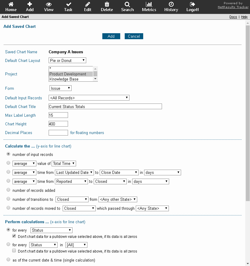
Saved Chart Name
The name of the chart can be changed. The name of the
system defined chart called
"Project Status (Default) [Users]" cannot be changed.
This option is not displayed for that chart.
Default Chart Layout
The chart layout determines the look and feel of the chart (e.g. whether it is displayed as a pie chart, table or other format).
Select a saved chart layout to be used with this saved chart. Samples are available in the Chart Layouts section.
Project
This field is only available if you have been given visibility to more than 1
project in Tracker. You can limit the metric criteria to only those records
that belong to a particular project(s) or * to match any project.
The selection made in this field will determine the options available in
the Form field. To select multiple projects, hold down the Ctrl button on
your keyboard while clicking on the projects to select them.
Form
This field is only available if you have been given visibility to more than 1
form in Tracker. You must limit the metric criteria to only those records that
were submitted using a particular form. However, depending on how your Tracker
Administrator has configured the system, you may be able to select multiple
forms or * to match any form. The
selection made in this field determines which fields are available for selecting
metric criteria. To select multiple forms, hold down the Ctrl button on your
keyboard while clicking on the desired forms to select them. If you have
selected one or more forms, a Get Fields button will be displayed. Click on the
Get Fields button to refresh the metrics criteria page with the fields that belong
to the forms you have selected. Only the fields and workflow states that are common to all
of the forms selected will be available in the chart options.
Default Input Records
This option determines which records will be included when performing the
calculations to generate the chart.
Select "<All Records>" to include all records in the database or choose a Saved Query
to limit the records included in calculations. The filtering which is done by
selecting a Saved Query is done based on the records as they are now (at the time
you display the saved chart) with the following exceptions.
Default Chart Title
Enter a title to be displayed at the top of the chart.
Max Label Length
A label in the chart is generated from the records included in the chart data.
Enter the maximum number of characters allowed for a label in the chart
(up to 50 characters can be displayed).
Chart Height
Enter the height in pixels that should be used to display the chart.
This option is not applicable to the Table layout.
We recommend using the default of "400" so that the chart area is visible within the
bounds of a user's screen when the browser window is maximized. Using a
setting like "600" or "800" will cause most users to have to use
a browser's scroll bars to see the full chart area.
Decimal Places
Enter an integer from 0 to 7 as the number of decimal places that should be included when data from a Floating Point number field is displayed in the chart. A default of 2 decimal places is applied when no value is entered for this property.
Return to Criteria Sections List
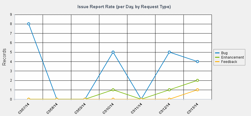
Calculate the ... (y-axis for a line chart)
Select a calculation to be done on the set of records you chose in "Default Input Records". If you selected a Chart Layout to produce a line chart, the selection made in this section will become the y-axis when the chart is displayed.
Number of Input Records
Selecting this option indicates that the number of records included in the chart data will
match the number of input records determined selection in the "Default Input Records" field.
Example 1: If you select this option and "<All Records>" is selected for
"Default Input Records", the chart data will include all records in the database.
Example 2: If you select this option and a saved query is selected for
"Default Input Records", the chart data will display all records in the database that
match the criteria in the saved query selected.
Calculated Value of an Integer or Float field
Selecting this option indicates that a calculation (average, total, minimum, maximum)
should be performed on the values of an Integer or Float field present in the set of records selected
in "Default Input Records".
Example: If you select this option and "average" value of "Estimated Size" field, then
the chart will calculate the average value of the Float field called Estimated Size within the
set of records selected for "Default Input Records".
Calculated Time Between 2 Date Fields in a Particular Date Increment
This option allows you to calculate a time (average, total, minimum, maximum) between the
values of 2 date fields in a set of records. Selecting "<Now>" for the second
date field indicates the calculation of time will be between the first
date field and the current date and time.
Example: If you select this option and "average" value from "Date Reported" to
"Fix Date" in "days", then the chart will calculate the average time in days between the
date fields selected for the set of records listed in "Default Input Records".
Calculated Time for Record to Progress From One State to Another
This option allows you to calculate a time (average, total, minimum, maximum) over a set
of records between
the time each record was in a particular state (state 1) to the time when the record was in
another state (state 2).
This calculation uses the Record History to compare the date a record was
in state 1 to the date a record was in state 2. The calculation will be the same if a record
moved directly from state 1 to state 2 or passed through other states before moving to state 2.
Example: If you select this option and "average" value from "Reported" to "Closed"
in "days", then the chart will calculate the average time in days it took a record to go from
the Reported state to the Closed state.
Number of Records Added
Selecting this option indicates that the number of records included in the chart data will match the
number of records created in the set of records listed in the "Default Input Records" field.
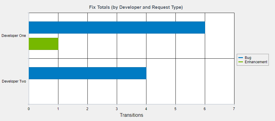
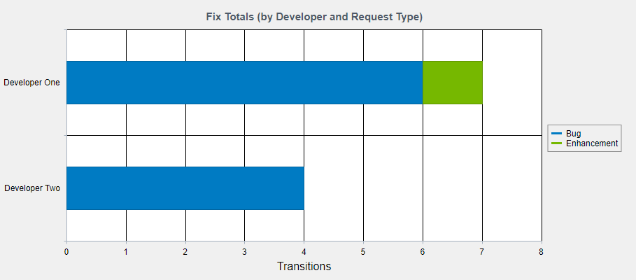
Number of Transitions to a State From Another State
This option allows you to calculate the total number of transitions that were made into
a state (state 2) from another state (state 1). Both Edit and Task operations are counted as transitions.
Selecting the option "<Any State>" for state 1 indicates
that all transitions that moved a record from any state (including state 2) into state 2 will be included
in the chart data. Selecting the option "<Any Other State>" for state 1 indicates that all transitions
that moved a record from any state (except state 2) into state 2 will be included in the calculation.
This calculation yields the total number of times a transition between two states occurred. The calculation
will count each time the transition occurred even if it occurred on the same record multiple times.
Example: If you select "Scheduled" as state 2 and "Reported" as state 1, then the calculation
will be the total number of times any record moved from the Reported state to the Scheduled state.
Number of Records Moved to a State Which Passed Through Another State
This option allows you to calculate the total number of records that moved to a state (state 2)
which passed through another state (state 1). Both Edit and Task operations are included in this calculation.
Selecting the option "<Any State>" for state 1 indicates
that the calculation will count any record which has moved to state 2 (including from state 2 itself).
Selecting a specific state for
state 1 limits the calculation to records that passed through state 1 before reaching state 2.
Unlike "number of transitions," this calculation will not include multiple
"hits" for the same record. Even if the same record passed from state 1 to
state 2 multiple times, it will only count the record once as it is counting number
of records and not number of transitions. Also, if a record loops while in state 2,
the record is assumed to have completed the move from state 1 to state 2, when it
first moves into state 2. This calculation can take longer to display the results than other
charts because a significant amount of history data can be involved.
Return to Criteria Sections List
Perform Calculations ... (x-axis for line chart)
Select an option to add a further constraint to the data that resulted from the option in the Calculate the ... (y-axis for line chart) option above.
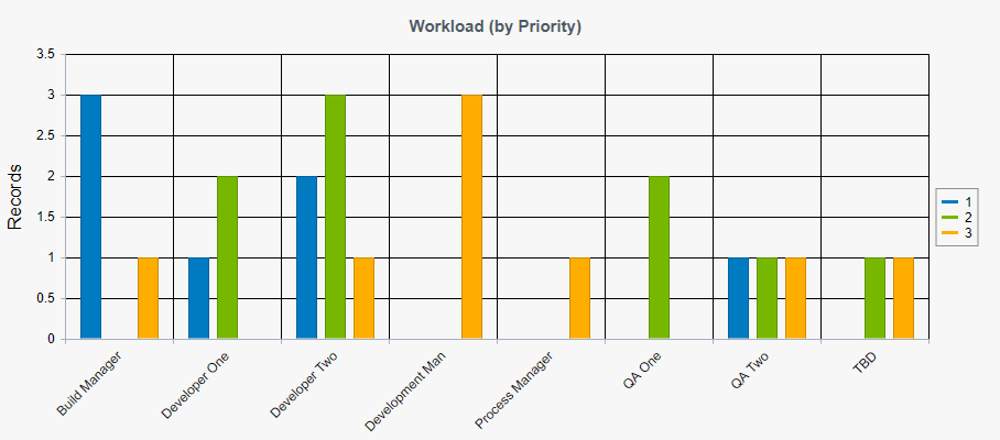
For Every Option in a Field
Selecting this option will perform the calculation selected in the
Calculate the ... (y-axis for line chart) option above for
every option within the field selected.
Example 1: If you select this option and "Project" as the field,
the chart will display a separate calculation for each project in your database.
Example 2: If you select this option and "Status" as the field,
the chart will display a separate calculation for each state in your database.
For Every State in <State Group> or For Every
Reported By or Assigned To in [User Group]
Selecting this option will perform the calculation selected in the
Calculate the ... (y-axis for line chart) option above for
every state included in the State Group selected or for
every user (Reporter or Assignee) in the User Group selected.
State Groups and User Groups are configured by your
Tracker Administrator in the Admin section.
Example: If you select this option with "Reported By" and "[Developers]",
the chart will display a separate calculation for each user in the Developers user group
who was the reporter of a record that matched the criteria in the Calculate the ...
(y-axis for line chart) section.
As of the Current Date and Time (single calculation):
This option indicates that the chart should perform the calculation selected in the
Calculate the ... (y-axis for line chart) option above
as of the current date and time.
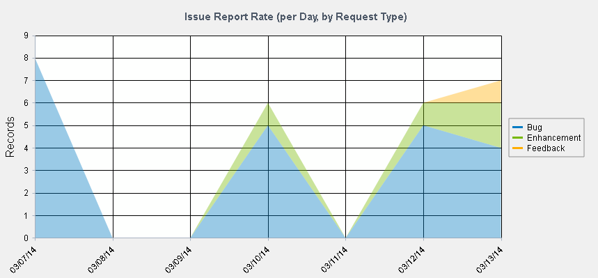
As of the End of or During a Time Increment for the Previous X Time Increments
This option indicates that the chart should generate the calculation selected in the
Calculate the ... (y-axis for line chart) option above as of the end of or during
each time increment for the number of increments selected.
Example: If you select "as of the end of" each "day" for the previous "2" "weeks", the chart
will generate 14 calculations
(one value for the calculation as of the end of each day for the last 2 weeks).
Dates are displayed as two part dates (month & day), except that the first (left most) calculation and any calculation that begins a new year will include a three part date (month, day, and year). All date parts are displayed using 2 digit values (with leading zeros if necessary), including the year. The date format is based on the preferences selected by the user who clicked Show Chart. The time zone used for calculations (to determine midnight of a date) is the time zone specified in preferences section of the user who clicked Show Chart. If you select "during each week" or "during each month," each week or month will be displayed as two dates with a hyphen between the two (a date range).
When you select week or month, the calculation may include a partial week or month as the most recent value (month to date, week to date) so that it always includes information up to and including the current day. Selecting month will always give you a partial month for the most recent (right most) value, unless today is the last day of the month. When you select "during each month," the months will always begin on the first of the month. When you select "as of the end of" or "during" each week, for the previous N weeks, you will always get data for a full week in each calculation. However, if you select "as of the end of" or "during" each week for the previous N months or years, you may get a partial week value (so that the data includes exactly N months or exactly N years). To get data that always includes exactly one week for each data point, use N weeks (rather than N months or N years).
As of the End of or During a Time Increment for a Date Range
This option indicates that the chart should generate the calculation selected in the
Calculate the ... (y-axis for line chart) option above as of the end of or during
each time increment for the specified date range. If you do not enter a value for the end of the date range
(second date), the chart will use the day on which the chart is run (it will use today
as the value). The dates you enter can include a time component, if desired.
You can either click on the calendar
icon to select a date or you can manually enter a date in the appropriate
format (e.g. "mm/dd/yyyy HH:MM:SS AM/PM" or the date & time format selected in the
Preferences section.).
Click on the day to select the date to be entered into the date field.
Click < or > to move backward or forward one month
or click << or >> to move backward or forward
one year. Click Now to set the date field to be the current date and time.
Click on Exclude Time if you want to exclude the time
information from being saved in the date field. For a field where the time information
has previously been excluded, click Set Time if you wish to include the current
time information in the field. Click OK to choose the
highlighted date to be entered into the date field. Date will be selected and calendar dismissed when
a date is clicked when the time is excluded. Dates displayed in
red are non-business days according to the
Business Days option in the Preferences
section. Click Cancel to dismiss calendar without saving changes.
Example: If you select "during" each "day" from "01/01/2018" to "01/05/2018", the
chart will generate 5 calculations
(one value for the calculation during each day in the date range specified).
Dates are displayed as two part dates (month & day), except that the first (left most) calculation and any calculation that begins a new year will include a three part date (month, day, and year). All date parts are displayed using 2 digit values (with leading zeros if necessary), including the year. The date format is based on the preferences selected by the user who clicked Show Chart. The time zone used for calculations (to determine midnight of a date) is the time zone specified in preferences section of the user who clicked Show Chart. If you select "during each week" or "during each month," each week or month will be displayed as two dates with a hyphen between the two (a date range).
When you select week or month, the calculations may include a partial week or month at the beginning and/or end, as necessary to fit within the date range. If you select "during each month," months are displayed from the first of the month to the end of the month, with the possible exception of the first and last months displayed. The first month may be a partial month if your date range does not begin on the first of the month. Your last month may be a partial month if your date range does not end on the last day of the month.
Return to Criteria Sections List
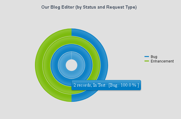
Breakdown Calculations by a Field
This option indicates that the calculations generated based on
the selections made above should be broken down by a field. For each calculation,
a value will be displayed for each option in the field selected.
In addition, if the chart layout selected for the saved chart contains a legend, one
legend entry will be present for each item in the field selected.
Example 1: If you select this option and select "Status", the chart will display
a calculated value for each state in your database.
Example 2: If you select this option and select a pulldown called "Product",
the chart will display a calculated value for each option menu item configured in the pulldown field.
Breakdown Calculations by Every State in a <State Group> or
by Every User in a [User Group]
Selecting this option indicates that the calculations generated based on the selections
made above should be broken down by each state included in the State Group selected
or by each user (Reporter or Assignee) that is a member of the User Group selected.
In addition, if the chart layout selected for the saved chart contains a legend, one
legend entry will be present for each state or user (Reporter or Assignee) in the
State Group / User Group selected.
Example: If you select this option and select "Assigned To" and "[QA]",
the chart will display a calculated value for each user in the the QA user group
who is the Assignee for the records that matched the chart criteria.
Do Not Breakdown Calculations
This option will not breakdown the calculations generated by the chart criteria in the
y-axis and x-axis sections above.
Don't Chart Data for a Breakdown Value if its Data is All Zeros
Checking the box for this option indicates that when the calculations are broken down
per the option selected above, a separate calculation should not appear on the chart
if its value is zero (e.g. it is zero for any particular option menu item / state / user).
Example: If you select the option "Breakdown calculations by the pulldown field
"Product", then check the box for the option
"Don't chart data for a breakdown value if its data is all zeros", and the chart data has 0
records that matched the criteria for Product A, the chart will not display a
calculation or legend entry for Product A.
Return to Criteria Sections List
Chart Layouts
A chart layout provides the formats used to display a saved chart.
Area
Clustered Bar
Clustered Column
Line
Pie or Donut
Stacked Bar
Stacked Column
Table
NetResults Tracker © 1997-2021 NetResults Corporation. All rights reserved.
 NetResults Tracker Help