 NetResults Tracker Help NetResults Tracker Help |
 |
|
|
Color Preferences |  | | |
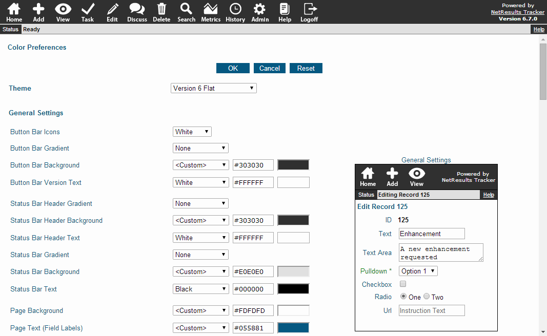
Color Preferences can be set to customize
the look and feel of the pages in Tracker.
You may wish to change the color preferences from their
defaults so that the Tracker pages
reflect the color scheme of your web site or organization.
Please note that setting color preferences may change
some style elements that are default for your browser
(e.g. If your browser displays buttons with a smooth edge,
the smooth edge will be lost when applying color preferences to buttons
using the options below).
To set the Color Preferences:
- Login to the
workgroup
as Admin
- Click on the Admin icon in the top
button bar
- Click on the Color Preferences link
- To change the color of an item, select a color from
the pulldown or select <Custom> to
enter the Hex code or select <Default>
to choose the browser's default value. Hex code must be in the
format "#XXXXXX". An explanation
of each item can be found in the
Color Preference Options section.
Your selections are displayed in a preview to the right of
the preferences.
- Click on the OK button to save the changes
A Reset button is available to reset the color preferences to their
settings as of the last time the Color Preferences were saved.
A Cancel button is available to return to the Admin section
without saving any changes to the Color Preferences page.

Color Preference Options
Theme
A set of pre-defined Themes is available. Each Theme has a set of color
preferences configured to give Tracker a color scheme that is consistent
throughout all pages. Selecting a theme will update the samples displayed in the
rest of the Color Preferences sections (General Settings, Browser Settings, etc.).
You can select a theme and accept its default color preference
settings or you can choose a theme as a starting point and make changes to individual
color preferences as desired. After changing any option(s) in a theme and clicking OK to save
the changes, the theme will be saved as "<Theme> (Modified)" to distinguish the
theme with changes added from the original theme. This allows you to experiment with changes to
the theme without losing the original theme.
"Version 6 Flat" is the default theme for new workgroups.
Version 6 is the theme that matches the default selections for workgroups created in
versions 6.0.0 - 6.6.1. Version 5 is the theme that has the color preferences that match the defaults for
Version 5.x workgroups.
General Settings

- Button Bar Icons
Select a color for the icons in the Button Bar. "White" is the default
selection for all Themes except "Before Upgrade". "BlackV6" is the
default for the Before Upgrade theme.
- Button Bar Gradient
Select a method for applying a gradient effect to the Button Bar
color (e.g. "None" is the method selected in the
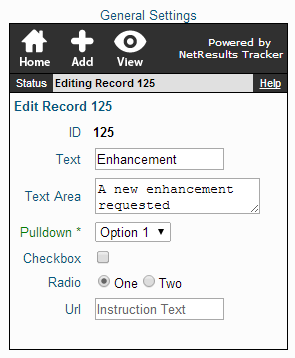
Button Bar
behind the text "Powered by NetResults Tracker" in the
General Settings Sample).
Selecting "None" will not apply the gradient effect to the
Button bar color.
- Button Bar Background
The color used in the background of
the Button Bar in the Tracker
pages (e.g. the area displayed in black
behind the text "Powered by NetResults Tracker"
in the General Settings Sample).
- Button Bar Version Text
The color used for the text of the Version text in the upper
right corner of the Button Bar (e.g. the color of the
text "Powered by NetResults Tracker" in the
General Settings Sample).
- Status Bar Header Gradient
Select a method for applying a gradient effect to the Status Bar
Header color
(e.g. "None" is the method selected in the
Status Bar Header behind the text "Status"
in the
General Settings Sample).
Selecting "None" will not apply the gradient effect to the
Status Bar Header color.
- Status Bar Header Background
The background color of the header in the
Status Bar (e.g. the black area behind
"Status" in the
General Settings Sample)
- Status Bar Header Text
The color of the text in the Status Bar
header (e.g. the color of the text
"Status" in the
General Settings Sample)
- Status Bar Gradient
Select a method for applying a gradient effect to the Status Bar
color (e.g. "None" is the method selected
in the Status Bar behind the text "Editing Record 125"
in the
General Settings Sample).
Selecting "None" will not apply the gradient effect to the
Status Bar color.
- Status Bar Background
The background color of the Status Bar
(e.g. the light gray color displayed behind
"Editing Record 125" in the
General Settings Sample)
- Status Bar Text
The color of the text displayed in the Status Bar
(e.g. the color of the text "Editing Record 125"
in the
General Settings Sample)
- Page Background
The background color of all of the
Tracker pages
(e.g. the white color displayed in the background
behind the Text, Text Area and Pulldown fields
in the
General Settings Sample)
- Page Text (Field Labels)
The color of the text displayed on the
pages in Tracker
(e.g. the color of the field labels "Text" and "Text Area"
in the
General Settings Sample)
- Required Field Label Text
The color of the field labels for fields that
are marked as "Required" on the
Add,
Task
or Submit
Pages
(e.g. the color of the field label "Pulldown*"
in the
General Settings Sample)
- Input Background
The color displayed in the area of a field
where text or information would be entered
(e.g. the white color displayed in the background
behind the text
"A new enhancement requested" in the
General Settings Sample)
Selecting <Default> will use the browser's
default color for the input background (white).
- Input Text (Field Values)
The color of the text entered into a field
(e.g. the color of the text "A new
enhancement requested" in the
General Settings Sample)
Selecting <Default> will use the browser's
default color for the input text (black).
- Instruction Text
The color of the text that appears in Text, TextArea and Url fields configured to use
instructional text. (e.g. the color of the text "Instruction Text" in the
General Settings Sample)
- Field Help Description Text
The color of the text that appears as the
help description configured for the
various Projects, Forms and Fields.
Browser Button Settings
These settings determine the colors of the browser buttons.

- Use Default Buttons (& Inputs)
Checking the box for this option will apply
the operating system's default color settings
to the buttons. When this option is enabled, the
rest of the Browser Button Settings are disabled.
- Gradient
Select a method for applying a gradient effect to the button
color (e.g. "None" is the method selected
in the Browser Buttons Sample).
Selecting "None" will not apply the gradient effect to the
button color. This option will not be available when
the option Use Default Buttons (& Inputs)
is enabled.
- Background
The color used in the background of
the buttons in the Tracker
pages (e.g. the blue color behind the text "Click"
on the button
in the Browser Buttons Sample).
This option will not be available when
the option Use Default Buttons (& Inputs)
is enabled.
- Text
The color of the text in the buttons
in the Tracker
pages (e.g. the color of the text "Click"
in the Browser Buttons Sample).
This option will not be available when
the option Use Default Buttons (& Inputs)
is enabled.
- Border
The color of the border of the button
in the Tracker pages
(e.g. the color of the border around the
"Click" button
in the Browser Buttons Sample).
This option will not be available when
the option Use Default Buttons (& Inputs)
is enabled.
Table Settings
Table Settings control the color preferences
applied to tables present on View,
Query, History, Metrics and Discussion Pages.

- Header Background
The background color of the top line of a table
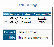
(e.g. the blue color behind "PRN", "Action",
"Status", "Assigned To" "Project" and "Title"
in the
Table Settings Sample).
This also sets the background color behind the field
names (left column) on the
View Page (e.g.
the color behind the text "Project" and
"Title" in the
Table Settings Sample).
- Header Text
The color of the text in the top line of a table
(e.g. the color of the text "PRN", "Action",
"Status", "Assigned To" "Project" and "Title"
in the
Table Settings Sample).
This also sets the color of the text of the field
names (left column) on the
View Page (e.g.
the color of the text "Project" and
"Title" in the
Table Settings Sample).
- Odd Row Background
The background color of each odd numbered row in
a table
(e.g. the background color of the row that starts with "1"
in the
Table Settings Sample).
This also sets the background color
behind the field values (right column) on the
View Page
(e.g. the color behind the text "Default Project" and
"This is a sample Title" in the
Table Settings Sample).
- Odd Row Text
The color of the text displayed in each odd numbered row
in a table
(e.g. the color of the text "1", "Reported" and "Admin"
in the
Table Settings Sample).
This also sets the color of the text of the field
values (right column) on the
View Page (e.g.
the color of the text "Default Project" and
"This is a sample Title" in the
Table Settings Sample).
- Even Row Background
The background color of each even numbered row in
a table
(e.g. the background color of the row that starts with "2"
in the
Table Settings Sample).
- Even Row Text
The color of the text displayed in each even numbered row
in a table
(e.g. the color of the text "2", "Closed" and "TBD"
in the
Table Settings Sample).
- Border
The color of the border around a table
(e.g. the color of the border around both tables
in the
Table Settings Sample).
Login Page Settings
The Login Page settings are available for customizing the color
of the Login Page and Self Registration Page (if applicable).

- Page Background
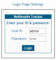
The background color of the area behind the Login box (e.g.
the white area behind the Login box
in the Login Page Sample).
- Header Gradient
Select a method for applying a gradient effect to the Header
color (e.g. "None" is the method selected in the
area behind the text "NetResults Tracker" in the
Login Page Sample).
Selecting "None" will not apply the gradient effect to the
Header color.
- Header Background
The background color of the top section of the Login box
(e.g. the blue color behind the text "NetResults Tracker"
in the Login Page Sample).
- Header Text
The color of the text in the top section of the Login box
(e.g. the color of the text "NetResults Tracker"
in the Login Page Sample).
- Body Background
The background color of the Login box
(e.g. the color behind the text
"Enter your ID & password.", "User ID" and "Password"
in the Login Page Sample).
- Body Text
The color of the text in the Login box
(e.g. the color of the text
"Enter your ID & password.",
"User ID" and "Password"
in the Login Page Sample).
- Border
The color of the border of the Login box
(e.g. the color of the border around the Login box
in the
Login Page Sample).
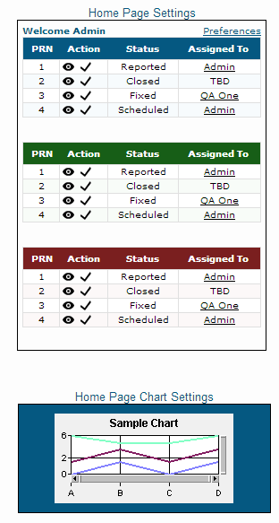
Home Page Settings
The Home Page Settings are available for customizing
the color preferences for the Home Page reports.

- Report 1 - Header Background
The background color for the header of the first Home Page report
(e.g. the blue background color behind the text "PRN", "Action"
"Status" and "Assigned To"
in the first (top) Home Page report
in the
Home Page Settings Sample).
- Report 1 - Header Text
The color of the text in the header of the first Home Page report
(e.g. the color of the text "PRN", "Action"
"Status" and "Assigned To"
in the first (top) Home Page report in the
Home Page Settings Sample).
- Report 1 - Odd Row Background
The background color of odd-numbered rows in the
first Home Page report
(e.g. the white background color of the row that starts with "1"
in first (top) Home Page report
in the
Home Page Settings Sample).
- Report 1 - Odd Row Text
The color of the text in the odd-numbered rows in the
first Home Page report
(e.g. the color of the text "1", "Reported" and "Admin"
in the first (top) Home Page report in the
Home Page Settings Sample).
- Report 1 - Even Row Background
The background color of even-numbered rows in the
first Home Page report
(e.g. the background color of the row that starts with "2"
in the first (top) Home Page report
in the
Home Page Settings Sample).
- Report 1 - Even Row Text
The color of the text in the even-numbered rows in the
first Home Page report
(e.g. the color of the text "2", "Closed" and "TBD"
in the first (top) Home Page report in the
Home Page Settings Sample).
- Report 1 - Border
The color of the border around the first Home Page
report
(e.g. the color of the border around the first (top) Home Page
report in the
Home Page Settings Sample).
- Report 2 - Header Background
The background color of the header of the second Home Page report
(e.g. the background color behind the text "PRN", "Action",
"Status" and "Assigned To"
in the second (middle) Home Page report
in the
Home Page Settings Sample).
- Report 2 - Header Text
The color of the text of the header in the second Home Page report
(e.g. the color of the text "PRN", "Action", "Status"
and "Assigned To"
in the second (middle) Home Page report
in the
Home Page Settings Sample).
- Report 2 - Odd Row Background
The background color of odd-numbered rows in the
second Home Page report
(e.g. the background color of the row that starts with "1"
in the second (middle) Home Page report
in the
Home Page Settings Sample).
- Report 2 - Odd Row Text
The color of the text in the odd-numbered rows in the
second Home Page report
(e.g. the background color of the text "1", "Reported"
and "Admin"
in the second (middle) Home Page report in the
Home Page Settings Sample).
- Report 2 - Even Row Background
The background color of even-numbered rows in the
second Home Page report
(e.g. the background color of the row that starts with "2"
in the second (middle) Home Page report
in the
Home Page Settings Sample).
- Report 2 - Even Row Text
The color of the text in the even-numbered rows in the
second Home Page report
(e.g. the color of the text "2", "Closed" and "TBD"
in the second (middle) Home Page report in the
Home Page Settings Sample).
- Report 2 - Border
The color of the border around the second Home Page
report
(e.g. the color of the border around the second (middle) Home Page
report in the
Home Page Settings Sample).
- Report 3 - Header Background
The background color of the header of the third Home Page report
(e.g. the background color behind the text "PRN", "Action"
"Status" and "Assigned To" in the third (bottom) Home Page report
in the
Home Page Settings Sample).
- Report 3 - Header Text
The color of the text in the header of the third Home Page report
(e.g. the color of the text "PRN", "Action", "Status"
and "Assigned To"
in the third (bottom) Home Page report
in the
Home Page Settings Sample).
- Report 3 - Odd Row Background
The background color of odd-numbered rows in the
third Home Page report
(e.g. the background color of the row that starts with "1"
in the third (bottom) Home Page report
in the
Home Page Settings Sample).
- Report 3 - Odd Row Text
The color of the text in the odd-numbered rows in the
third Home Page report
(e.g. the color of the text "1", "Reported" and "Admin"
in the third (bottom) Home Page report in the
Home Page Settings Sample).
- Report 3 - Even Row Background
The background color of even-numbered rows in the
third Home Page report
(e.g. the background color of the row that starts with "2"
in the third (bottom) Home Page report
in the
Home Page Settings Sample).
- Report 3 - Even Row Text
The color of the text in the even-numbered rows in the
third Home Page report
(e.g. the color of the text "2", "Closed" and "TBD"
in the third (bottom) Home Page report in the
Home Page Settings Sample).
- Report 3 - Border
The color of the border around the third Home Page
report
(e.g. the color of the border around the third (bottom) Home Page
report in the
Home Page Settings Sample).
- Chart Background
The background color when a chart is displayed on the Home Page.
"<Transparent>" is available as a selection, indicating
that the Chart Background Color will be the Header Background Color
for Report 1, 2 or 3 (the position
on the Home Page in which the chart is selected).
In the Home Page Settings Sample,
a <Custom> color is selected by entering in a hex code in the form
of "#XXXXXX".
- Chart Foreground
The color of the text and foreground of a Home Page chart (e.g. x-axis
and y-axis labels, chart title, gridlines, legend text).
"<Text Color>" is available as a selection, indicating
that the Chart Foreground Color will be the Header Text Color
for Report 1, 2 or 3 (the position on the Home Page in which the
Chart is selected). In the Home Page Settings Sample,
Black is selected.
- Chart Grid Background
The background color of the grid on bar and line charts displayed on the Home
Page. "<Transparent>" is available as a selection, indicating
that the Chart Background Color will be the Header Background Color
for Report 1, 2 or 3 (the position
on the Home Page in which the chart is selected).
In the Home Page Settings Sample,
the Chart Grid Background is White.
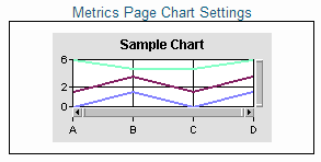
Metrics Page Chart Settings
Metrics Page Chart Settings determine the color
preferences for charts displayed in the Metrics Page.

- Background
The background color of a chart.
"<Transparent>" is available as a selection, indicating
that the Background Color will be the Page Background Color
as set in the General Settings section.
In the Metrics Page Settings Sample,
a <Custom> color is selected by entering in a hex code in the
form of "#XXXXXX".
- Foreground
The color of the text and foreground of a chart (e.g. x-axis
and y-axis labels, chart title, gridlines, legend text).
"<Text Color>" is available as a selection, indicating
that the Foreground Color will be the Page Text (Field Labels) Color
as set in the General Settings section.
In the Metrics Page Settings Sample,
Black is selected.
- Grid Background
The background color of the grid on bar and line charts.
"<Transparent>" is available as a selection, indicating
that the Chart Background Color will be the Page Background Color
as set in the General Settings section.
In the Metrics Page Settings Sample,
the Chart Grid Background is White.
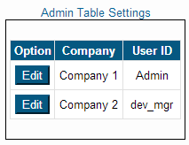
Admin Table Settings
Admin Table Settings determine the color settings for tables
displayed in the Admin section (e.g. the list of fields in the
Fields section, the
list of users in the User Accounts
section).

- Header Section Background
The background color of the top row for tables
displayed in the Admin section pages
(e.g. the background color behind the text
"Option", "Company" and "User ID" in the
Admin Table Settings Sample).
- Header Section Text
The color of the text in the top row for tables displayed
in the Admin section pages
(e.g. the color of the text "Option", "Company" and "User ID"
in the
Admin Table Settings Sample).
- Left/Button Pane Background
The white background color of the left pane in the tables
displayed in the Admin section pages
(e.g. the background color behind the "Edit" buttons
in the
Admin Table Settings Sample).
- Right Pane Background
The background color of the right pane in the tables
displayed in the Admin section pages
(e.g. the white background color behind the text "Company 1",
"Company 2", "Admin" and "dev_mgr"
in the
Admin Table Settings Sample).
- Right Pane Text
The color of the text in the right pane in the tables displayed
in the Admin section pages
(e.g. the color of the text "Company 1",
"Company 2", "Admin" and "dev_mgr"
in the
Admin Table Settings Sample).
- Border
The color of the border around the tables displayed in the Admin section
pages
(e.g. the color of the border around the table in the
Admin Table Settings Sample).
Color Preferences for other Features
The color preferences for the following features can be found in
other sections:
Submit via Web for Unregistered Users
Knowledge Base
NetResults Tracker © 1997-2014 NetResults Corporation. All rights reserved.
